The files before the quote
On Thursday, October 8th, sometime in the evening, I got thrown into a group message between a client of mine and Ellen of Prospera Real Estate Collective. I was told she needed a web development manager for an existing website. I was given very little. I ended up speaking with Ellen the next day.
She told me she had a website she wanted to redo, and she wanted it done pretty quickly. The developer she typically worked with was too busy.
I did ask for the files before I committed to anything, because I wanted to see what was done. Everything she had sent him to get started, her proposal, all that stuff. I wouldn’t have taken it on if I thought it was a genuine mess.
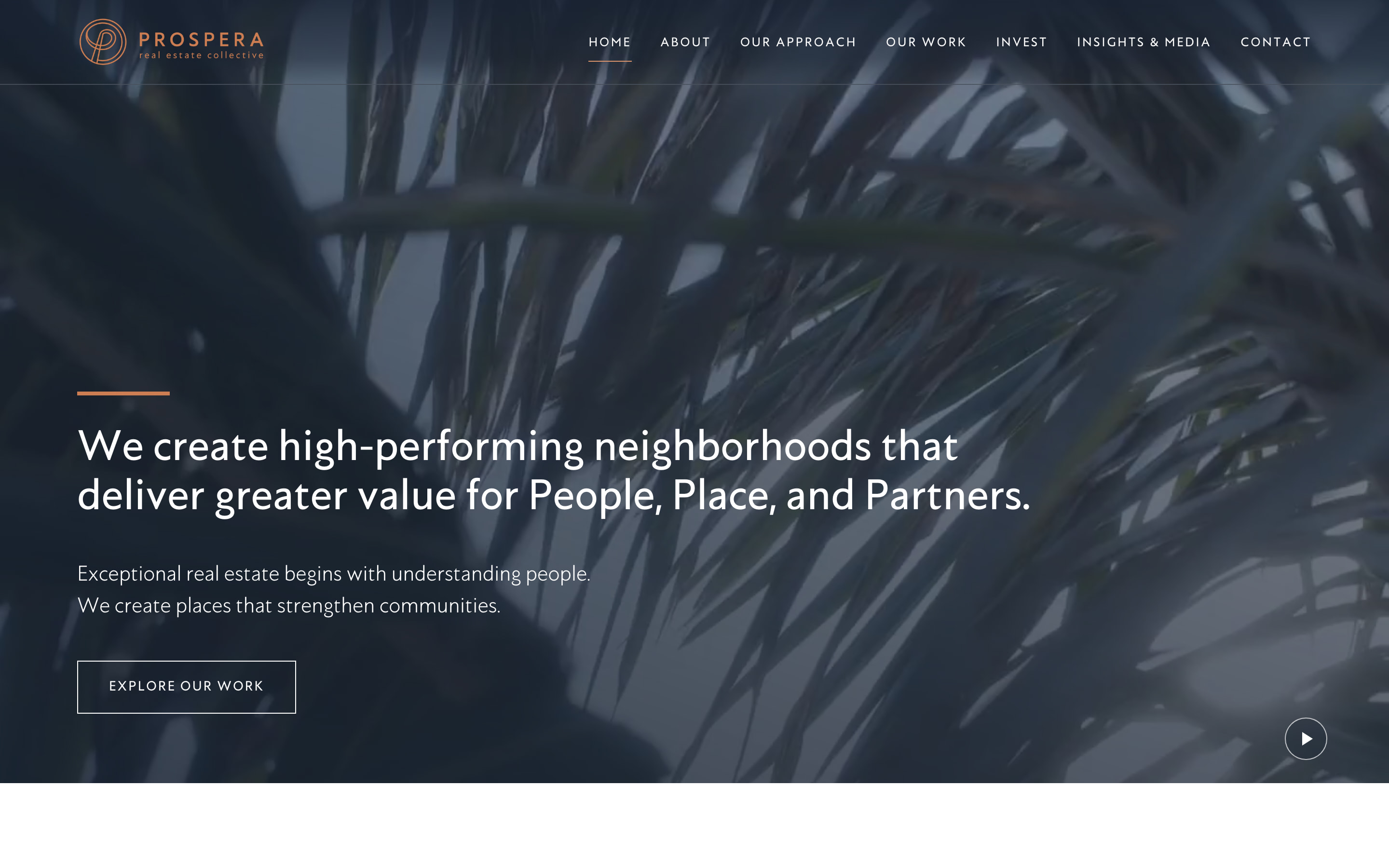
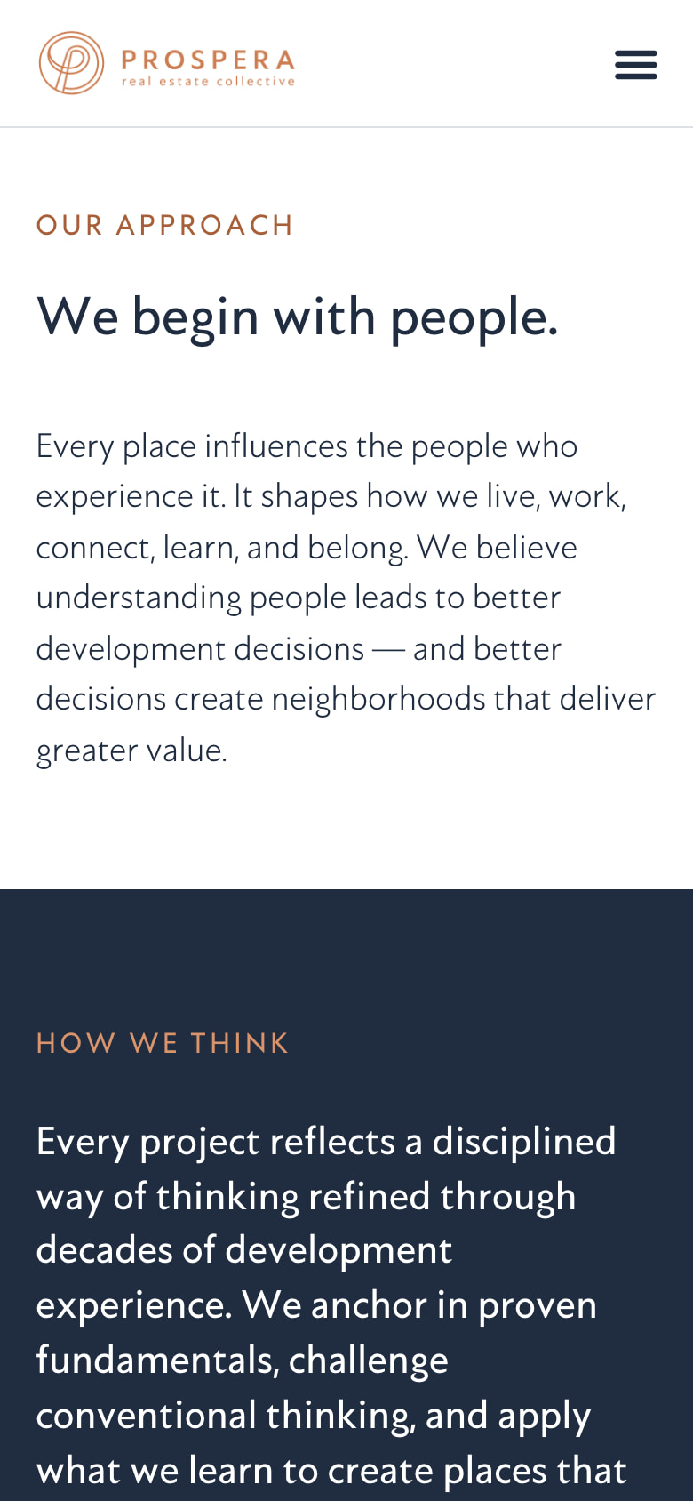
What came back was an Elementor kit exported from the previous developer’s own test site. It carried the global colors, navy and copper, and the Astro font the brand uses. It had a Home page with a video hero, a section called Our Philosophy, and a label reading “Latest Insights” with nothing underneath it. It had one CTA template, which said “Let’s build the future together.” There was no header, no footer, no menus, no posts and no other pages.

It was unfinished, and there was still a lot to build. But it was a good start. I wasn’t inheriting some slacker’s work.
I happened to have a solid two weeks where all I really needed to do was play video games. I’d just bought Star Wars Galactic Racer that day, and I had Final Fantasy Resonance on pre-order, so I’d kind of just planned on playing those with my free time. And then this fell into my lap. I’m not gonna say no to work and money.
Why nobody wanted it
I don’t have nearly as much experience with Elementor as I do with other page builders, like Divi, and especially Enfold. Having built a lot of WordPress websites with page builders for clients, I almost feel like it can sometimes take longer. Because to do it right, you’ve got to make sure you’ve either styled these elements or saved templates, as well as written documentation for if they want to edit their site. You do a bunch of CSS, HTML, PHP, JavaScript. And then you’re building all over again when you’re going in and adding your content. So it’s like you’re building twice. And it gets annoying.
I personally don’t like web builders. I understand why they exist. They exist for clients who need to manage their websites. For me, they largely slow me down.
Though concerning Elementor, thanks to things like AI, searching through documentation and figuring out weird issues is easier than the traditional way of going through Google, searching documentation, searching forums. For answers to things you can just kind of ask ChatGPT: hey, I’m having this issue, do you have any idea what’s going on here? You can ask it, has anyone else experienced this? And it will find blog articles, forum comments, help articles.
It’s her website. She picked the thing she can run. That’s the limit, and you work inside it.
There just wasn’t time to pivot. She needed a website, and she needed it done. We were talking on the 8th. She wanted it on the 23rd.
The database is never the only copy
Before any of it started, I set one rule for the build: the site had to exist as files, not just as a database. Every page, template, post and setting had to be reproducible from a folder. The database was never going to be the only copy of the work.
At an agency I worked for, all of their websites used page builders. There was no breaking out of this. I would find that before I got to this agency, they were using the tools inside the page builders to customize everything. So there’s always CSS. If it wasn’t custom tooling on the elements themselves, there might be custom CSS in different parts of the website: in a custom CSS file, in Enfold or the theme’s own custom CSS, as well as inside the elements. It just was frustrating.
I said, no more of this, and started styling these elements directly in one CSS file. As clients used these websites, they would never necessarily remember all these little things when they wanted to publish new content. And no matter all the training they were given, design would drift. So the less they have to touch to style things, the better.
If you’re taking one of these over, here’s the shape I’d recommend. Build the pages in the editor, like a person. But keep the exportable artifacts in a folder under version control: the kit export, the posts, the field definitions, the stylesheet, the logo and the fonts. Write the runbook, which is the ordered list of what gets imported and in what order, along with the traps. Then rehearse it. Build an empty WordPress, import only that folder, follow your own runbook, and check the result. Do it again after every round of revisions.
Her notes
I sent the preview out Monday the 19th. I sat on my work a little bit, to review it and give it some time. It was originally scoped for Wednesday, so we were still ahead of schedule, and I didn’t want to rush anything out just in case I found something, because things were going so smoothly.
Her notes came back on the Thursday. Eleven of them in the morning, left as pins on the preview in a review tool called Pastel. I read them, sorted them against what the proposal actually covered, and sent her questions about the handful that needed her input. She didn’t answer the questions. She kept reviewing instead. Forty-four more notes arrived over the course of the afternoon, on every page of the site. All of it was rebuilt and back on the preview that night.
I don’t like working that way. The platform she was sending notes on was entirely new to me, so I had to first figure it out. And that’s what made triaging the notes important. As I was working, notes were coming in, and yeah, that frustrated me.
A frustration I had with Ellen was getting her to answer questions. More often than not she never really directly responded to them. She would just go in and leave more notes.
The tool was hers, not mine. I had no account with Pastel; I was a guest on a shared link. So before I built anything, I copied every one of her notes out into a file of my own, word for word, with where each one was pinned.
The next morning, six more had arrived overnight. Reading the whole set of sixty-one again against that copy, four of the notes said something different than they had the day before. No new pin, no notification, no reply in the thread. One of them had changed a line she’d already approved. Pastel’s activity log only ever says “created,” so there is no record of an edit.
Without it, I wouldn’t have caught her stealth edits.
It nearly didn’t work, either. One entry in my copy had been paraphrased rather than transcribed, and a few rounds later that paraphrase read as an edit that had never happened. A copy you paraphrased is not a copy.
One of her notes asked me to “make this the correct logo color (it’s like a pink/peach).” The logo file was already the brand copper. A CSS filter was turning it white over the video on the home page, and the fix was deleting one rule.
It’s pretty common. So it’s important, when you’re approached with those things, not to stay locked into what the client’s report says is the obvious cause. Once I realized the logo was already the correct color, clearly there was something else going on. CSS was really my first guess.
The other one she couldn’t name. “Something doesn’t feel quite right,” on a heading, and then again on other pages as the font bothering her, too thin for headline text. She was right. The body text was set in the bold weight of the brand font and the headings in the light one, so on every page the paragraphs outweighed the headlines above them. Switching the headings to the heavier weight fixed the whole site at once.
I think it’s natural, especially when you get this quite a bit from clients. When they don’t have the language, I can empathize with it, because I often struggle to find the language to articulate what I’m looking for outside my own areas of expertise. In creative circles, whether it’s design or development, it’s common to express frustration with this sort of feedback. But it’s useful to keep in mind the ways that we do it ourselves.
How it got past me, I don’t really know. Maybe I was too married to the original design to really see the issue. Maybe I thought that’s what she wanted. I think a failure on me was not asking more probing questions.
I got a design degree. I should be able to find the vocabulary for those who don’t have it. That’s part of the education. It’s part of the job. It’s part of the challenge.
I sent the revisions back on the Friday morning, said the preview was updated, and asked for a launch day. Nothing came back that day, or over the weekend. I followed up on the Monday and sixteen more notes arrived within a couple of hours, three of them reversing earlier notes of her own. I built those too, as a goodwill wrap-up. The proposal included one round of revisions. This was the fourth.
Launch it tonight
I had offered to launch the website late Tuesday night. I had planned for Monday night to make myself some dinner and play some games. I didn’t even expect her to follow up, to be honest, given how things had been going. So I went downstairs and was ignoring my phone. I can’t remember if I was watching television or playing a video game. And I just happened to hear the email notification come in from my desktop upstairs, and something told me to go check. Sure enough, she wanted to launch that night.
I wanted to say no. I did. But I had no real reason other than that I just didn’t want to work, and that didn’t sit right with me.
She was going to a conference the next morning. That was one of the reasons she wanted the website done so quickly in the first place: she wanted to show it to people. And if I decided to be lazy because I wanted to play some video games, and launched it Tuesday instead, I still would have made my money. But then all these folks she’s meeting go to her website, and they say, well, that’s a nice website. They might ask her who did it. And I’ll be top of mind to her.
I planned for this. Way in advance of launch I did the whole thing in reverse, to rehearse it and make sure it went as smoothly as possible. I coached her to expect up to four hours: maybe an hour and a half of real work, then thirty to forty-five minutes of checking. So I’m not losing any time. I have everything to gain. I rehearsed for this. Let’s do it.
Backups first, three ways. The holding page went up at 8:27 and the site was live at 8:48, so visitors saw “we’re updating our website” for twenty-one minutes.
About fifteen of those twenty-one minutes went on four problems the rehearsal could not have found, because a rehearsal imports from a source that stays online and a real launch doesn’t.
- Elementor’s import screen crashed on the kit.
- The video and the images inside two of the essays were still loading from the preview server, and would have broken the moment its password went back on.
- The band across the bottom of every page vanished: the footer pointed at an ID that only existed in the build.
- WordPress refused the logo, because it was an SVG.
Two more had already been caught, an hour before go-live, by running the rehearsal one last time. The launch files had been regenerated that afternoon with a placeholder in place of the real address, so every image in them pointed at nothing and the import would have arrived with no pictures at all. And the four category lists on the Insights page store category IDs, which change on import, so all four would have come up empty. Both of those were introduced by the later rounds of revisions, after the previous rehearsal.

The “it’s live” email went out at 9:58.
The things that were already broken
Two things were broken before I got there.
The first was her email. On day one I went through the hosting read-only, without changing anything, and found that mail was set to route locally, while her actual email runs on Microsoft 365. Every message the contact form ever sent would have stopped on the web server. In the database were 66 messages from the old site’s form, dating from December 2023 to October 2026. I exported them to a spreadsheet and sent them to her with everything else at the end.
The second was the server. The site was running PHP 7.4.33, which stopped being supported at the end of 2022. The week before launch, two critical remote-code-execution bugs were disclosed in PHP and were already being exploited. There was no official fix for 7.4. She was also paying GoDaddy a few dollars a year for an add-on whose only function is to keep you on a version that old. Everything from 8.2 onward is free.
The fact that she’s paying anything at all to stay on an end-of-life PHP version is nuts for a brochure website. Extended support is for systems that are genuinely pinned: a vendor application, something under a compliance freeze. This is a brochure website. There’s nothing in it that can’t be upgraded.
I’d have done the upgrade regardless, because I’m not going to put my name on a site that I can’t reliably say, on day one, is as secure and as up to date as I can reasonably assure it to be.
It went to 8.3.36, every page came back identical, and the add-on came off with her approval.
The things nobody asked for
The things I throw in that weren’t in the proposal, those are me.
All of these little things I do after, at some point in my career, being confronted with what happens if you don’t. The professional embarrassment that hits you when one of these little gaps gets noticed.
A perfect Lighthouse score matters to me so I can point to real numbers. Clients are always vaguely asking about SEO, and frankly they’re used to getting equally vague answers from SEO snake oil salesmen. This is something I can point at and say, this is how your website performs, and this is how it affects your search visibility. It’s a badge of pride.
So many freelancers forget the branded 404 page. I used to, earlier in my career. Then there’s the author archive, which is one of those annoying things about WordPress, because people are using a blogging platform for everything except blogging. So you have to go in and hide comments and author archives. Because when they show up and people see them and they look like garbage, even if those people don’t care and just move on, I’m embarrassed by it. I don’t like that embarrassment.

The video pause button is just good practice. I kind of get annoyed when clients want to take it out.
Would I do it again
Would I take another job finishing someone else’s half-built site? Sure. I’ve done it before, and this was probably one of the better ones, if not the best half-built site I’ve ever taken over. I’d do it again. I don’t think I’ll get a project where I’m resuming someone else’s work again, at least freelance, with as good a foundation as this one had.

The CTA template from that first export is still on the site. It’s the band that runs across the bottom of every page, the one that disappeared during the import and had to be put back at ten o’clock at night. The wording is different now. The thing itself is his.
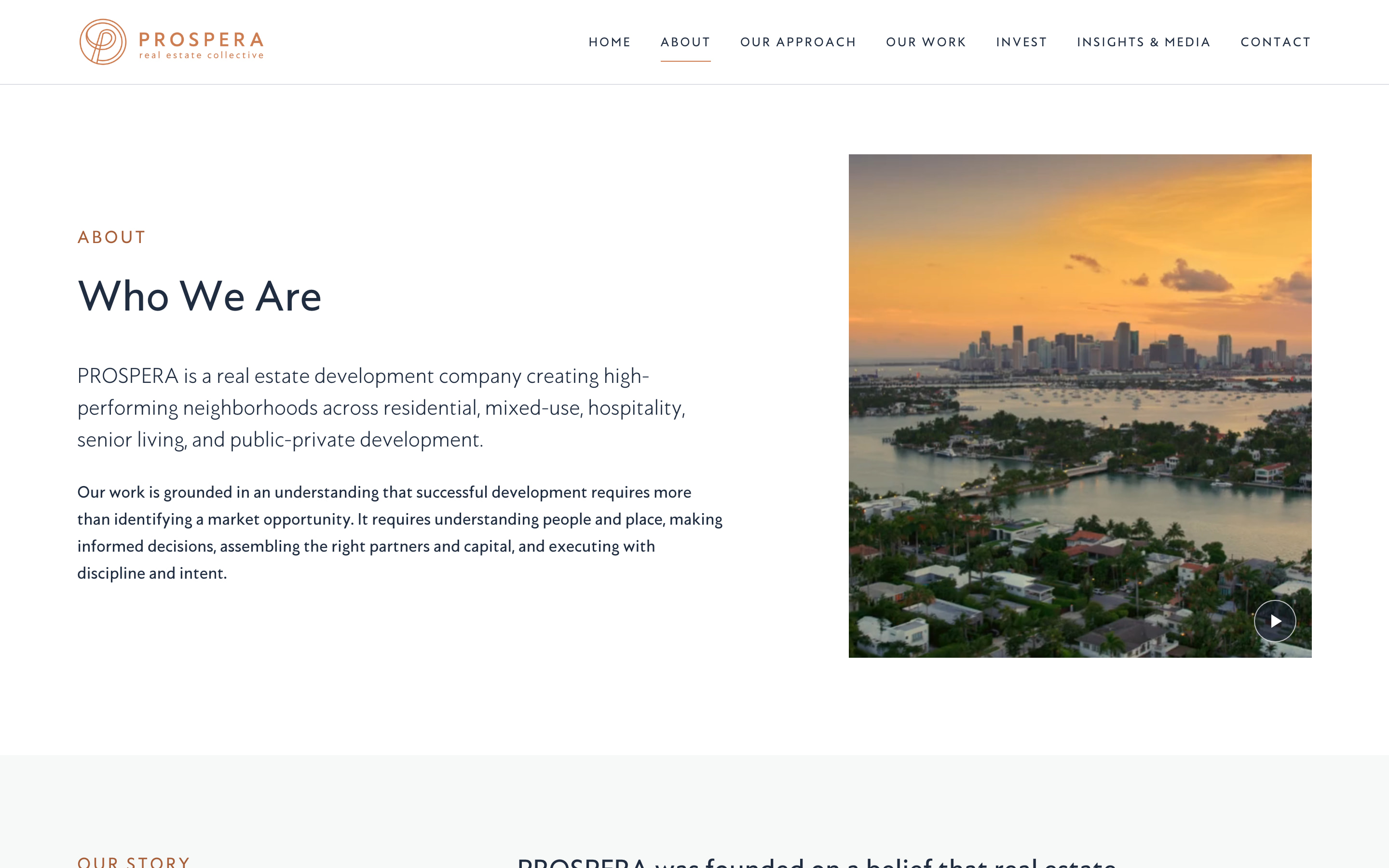
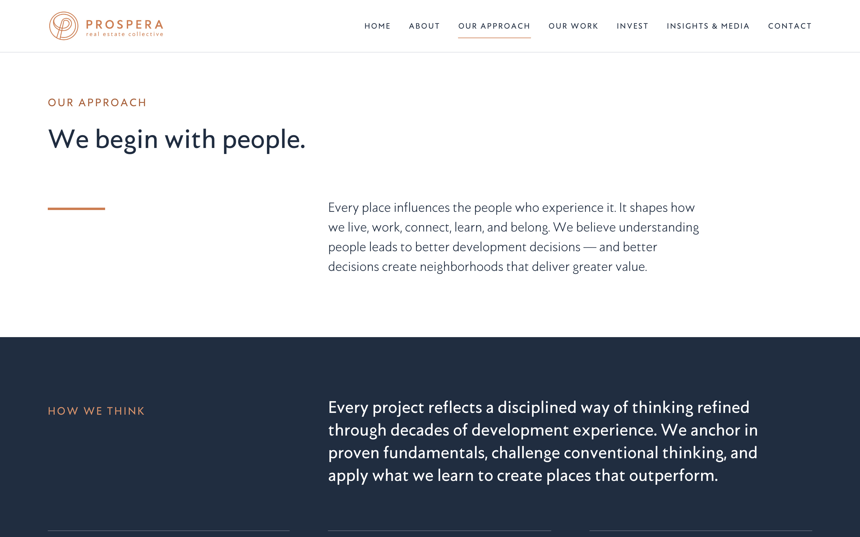
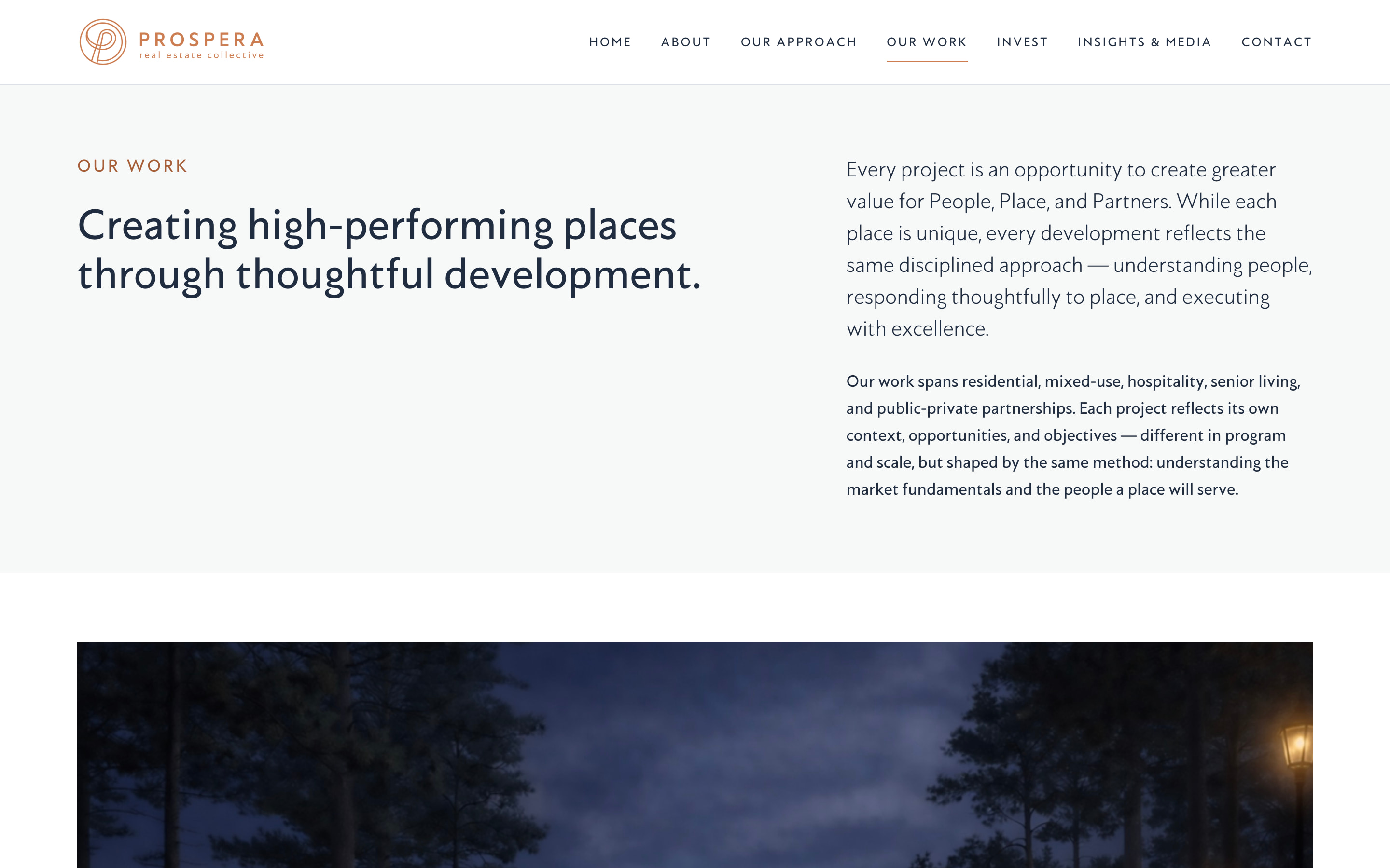
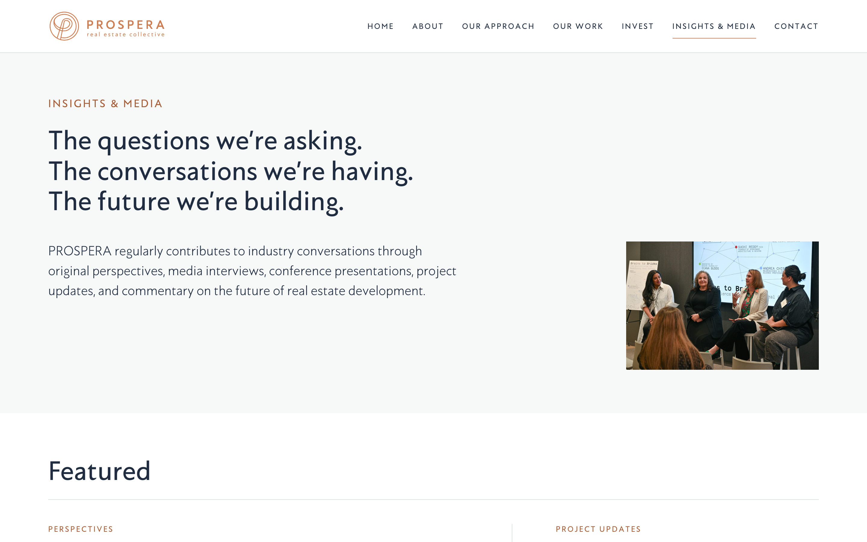
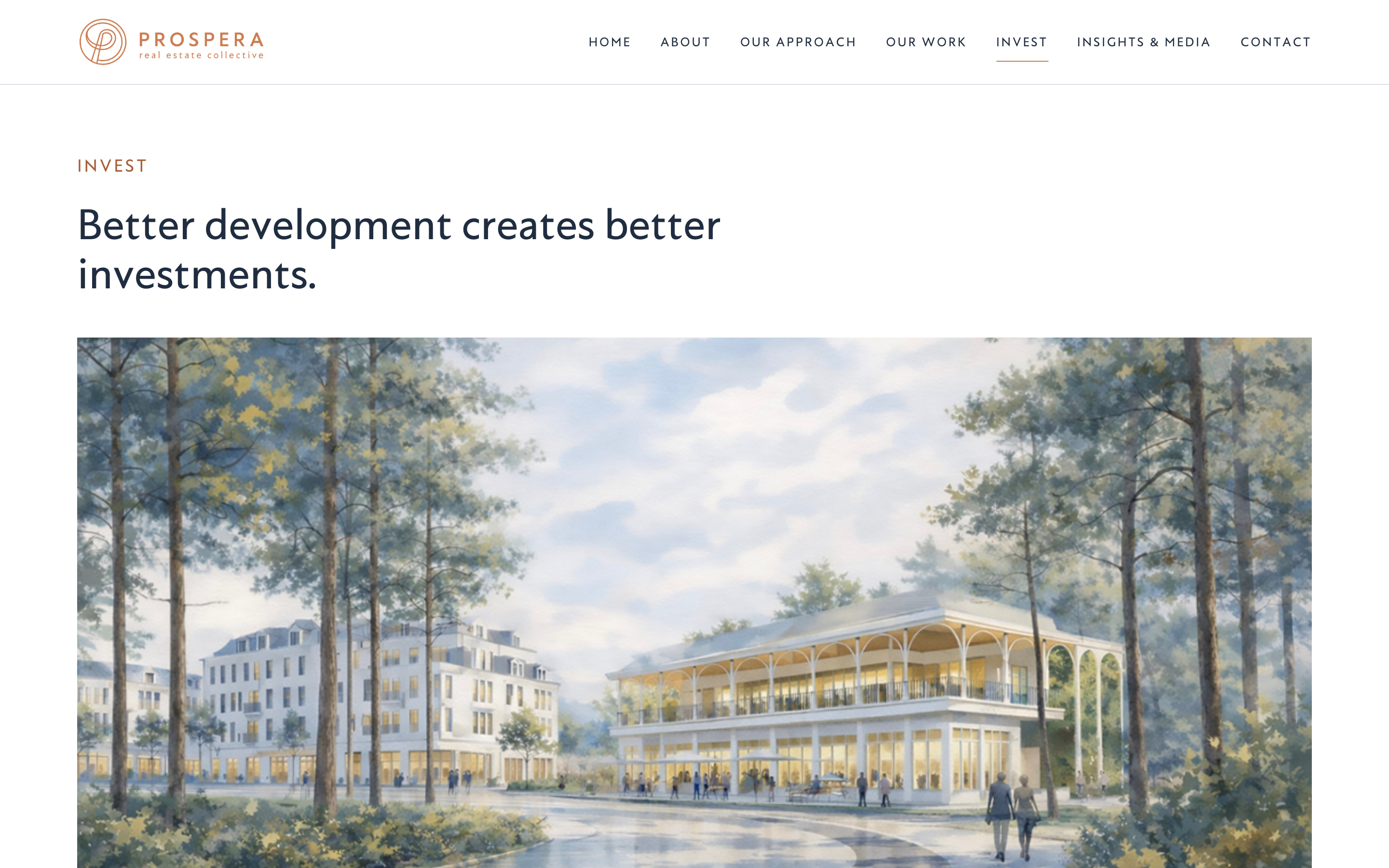
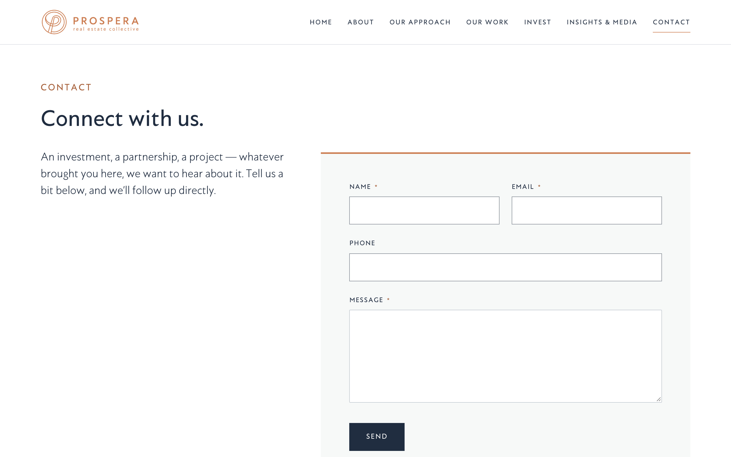
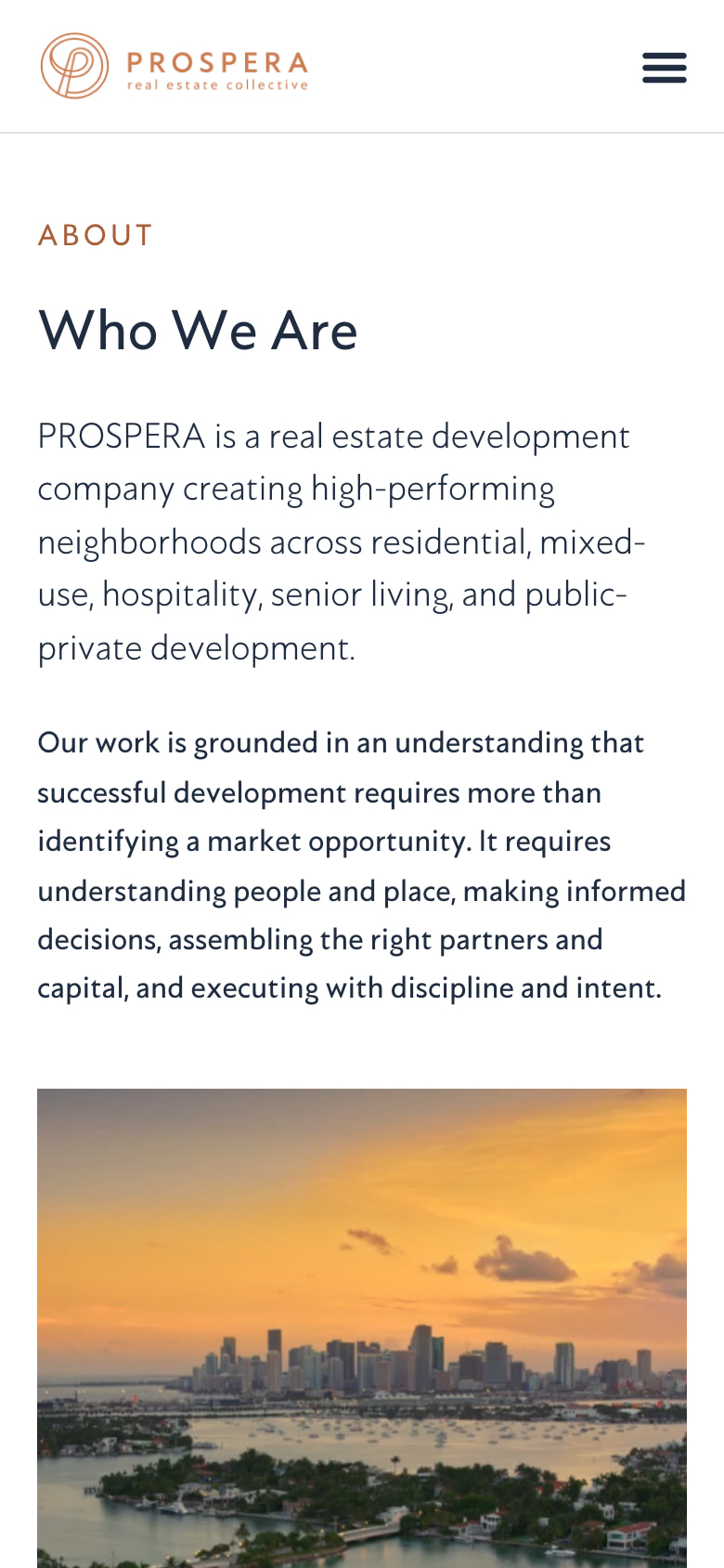
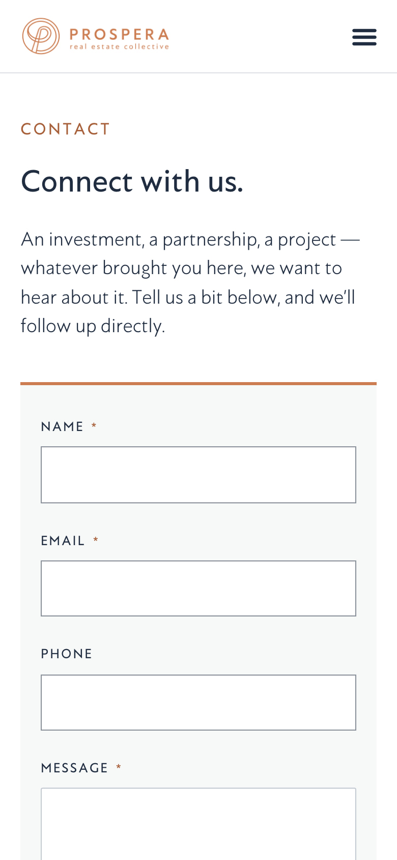
The site, desktop and phone